Heideldesign Blog
Movable Type and Wordpress tips & tricks, website design and interaction development in Savannah GA.
Unique Websites for Churches
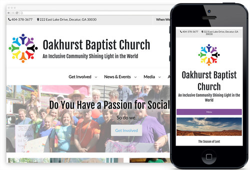
All churches are unique, and need to express a unique identity to visitors and members online. That's why no church should settle for a cookie-cutter website.
Wordpress 5.0, Gutenberg and Your Website
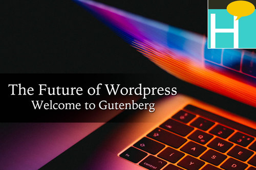
What is Gutenberg and what should you do to prepare? Wordpress sees its latest update as the path to secure its future. Find out why.
Website Backups Are Your First Line of Defense
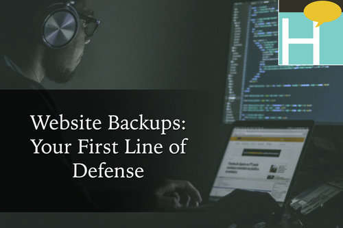
While there are many things you can do to strengthen your website's security against a malicious hack, it is important to have website backups on hand and be ready if a worst-case scenario hits your site.
Using 'Click to Call' Links to Empower Mobile Users

Sometimes, it's better to talk to a person than visit a link. Learn how to create "Click to Call" links for your website.
What is the Best Way to Show Videos on My Website?

One question we often get from clients - what's the best way to show videos on my website? Should I upload the video file directly to a page? Or should I use a third-party streaming service like YouTube or Vimeo? Our answer: let the third-party streaming services do all the work for you. Here's why.
Just Launched: ButlerTech.org
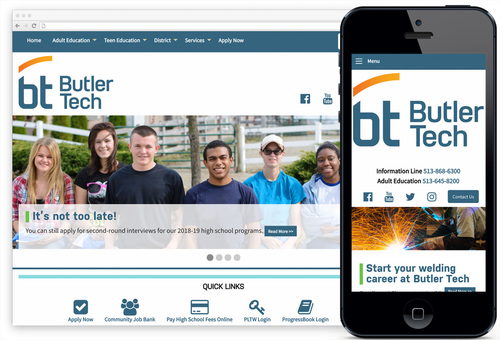
Before a student ever sets foot on a college campus, many will browse the school's website. Does your website portray a modern, professional personality? One that is welcoming and vibrant? We invite you to look at one of our recent projects, ButlerTech.org.
Just Launched: GaPHA.org
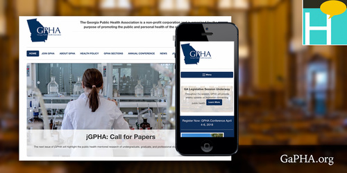
GPHA wanted to begin 2018 with a design refresh. The organization was looking for a more modern aesthetic, better content organization, and a way to showcase its online journal, the jGPHA.
Your Questions Answered

If you're interested in a website quote, here are answers to common questions about how we operate at Heideldesign.
Google Chrome to Require HTTPS Beginning in October 2017
Beginning in October 2017, Google's Chrome web browser will begin flagging any website that includes form fields as "NOT SECURE" if the page is not served via HTTPS. We hope you find the FAQ below helpful in understanding this...
Restaurant Websites: A Feast for the Eyes
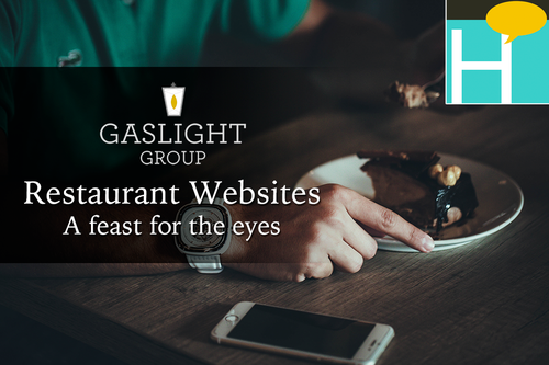
Heideldesign just launched 4 new restaurant websites for Gaslight Group in Savannah. The designs focus on mouth-watering food photography, and offer easy access to info like location, hours and menu to convert web visitors into restaurant patrons.