
MT Skeleton: A Free Responsive Theme for Movable Type
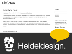 We are very happy to release MT Skeleton as a free theme for Movable Type 4. It is based on the Skeleton responsive framework and is easy to install and customize. All of the elegant, minimal Skeleton styles are left in place.
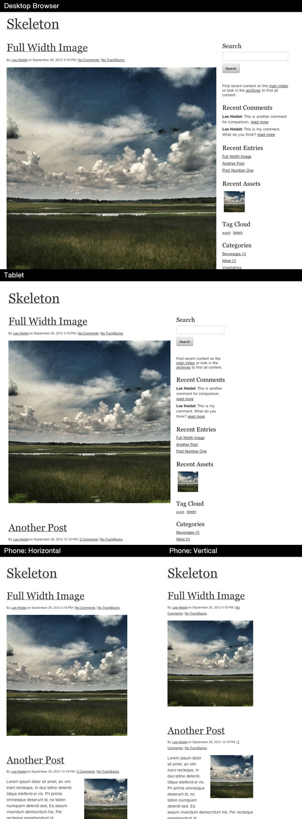
MT Skeleton is optimized for implementation via the Style Library function. It has three layout options (two column thin - wide, two column wide - thin, three column thin - wide - thin). It features a responsive grid that targets desktop browsers, tablets and vertical and horizontal handset orientations.
Live Demo
Download
Click through to view screenshots and more information.
Screenshots
Movable Type Compatibility
Skeleton has been successfully tested with Movable Type 4.38. No additional plugins or modifications are required. It should be fully compatible with all versions of MT 4.2 and later.
Browser Compatibility
Tested on Windows: Chrome 21, IE 9, IE8, Safari 4, Firefox 14
Tested on Mac: Chrome 22, Safari 6.01, Firefox 15.01
Tested on Mobile: Mobile Safari (iPad 1, iPhone 3GS, iPhone 5) / Android 2.34 (Nexus 1)
Installation
- Upload the "skeleton" folder to the following path on your MT installation: /mt-static/themes
- Add the following line to the inside of the <head> section of the "HTML Head" template module if using the default Classic Blog template set. If you are using a different template set, add this line to the inside of your <head> section in the appropriate tempalate(s).
<meta name="viewport" content="width=device-width, initial-scale=1, maximum-scale=1">
or, to allow pinch/zoom:
<meta name="viewport" content="width=device-width, minimum-scale=1.0, maximum-scale=2.0 user-scalable=yes"> - Go to Design > Styles in the Movable Type admin software and choose "Skeleton Responsive"
- Select a layout from the drop-down menu and click "Apply Design"
- Rebuild your entire blog. You may need to clear your browser cache to see the new design.
Customization
To customize this theme, you may edit the Stylesheet template (styles.css) in the area following the Stylecatcher import comments. For additional guidance on targeting device resolutions, check the commented screen.css file in this theme package.
Complete installation instructions and an overview of the theme's intended usage can be found in the download's Read Me file.