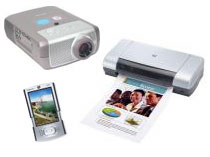
Screen, Print, Handheld, or Projector
No matter what the medium, style sheets enable your site to look its best. By creating the web page once, it can be formatted many ways, with no extra effort.
 At Heideldesign, we believe in making things easy: For our clients and their customers.
One way we do that is by creating specialized style sheets, or formatting templates, for different types of media. It all takes place "behind the scenes" with no extra input or time spent by the content creator (you) or the content consumer (your customer).
Have you ever been on a web site and seen a link for a "Print Version" of a page? Instead of clicking the link and opening a new page, then printing, we make a print-version automatically. This print version often has larger type and removes web-only elements like menus and advertising. The user only needs to click print once, and it is formatted in an easy to read, transportable manner.
Print styles are the most common usage of alternate style sheets. But, they can also be used for handheld devices (like PDAs and some mobile phones) or projectors (for presentations). This enables you and your users to remember only one site address and access the content in many ways specially tailored to your environment. Simple and easy.
Does your site have automatic print and handheld styles? Print a page and see. Is it a jumbled, cluttered mess? Is content missing? What about on a handheld? Are the images too large or the text too small? With a few simple adjustments, we can provide an easy way to print and consume professionally formatted web pages - almost like magic!
Contact Us and learn more about alternate style sheets for screen, print, handheld, or projector.