
Mobile CSS vs. Unique Mobile Templates
When planning for a mobile website, there are two ways that you can approach your project. The first method would utilize your existing site design, but optimize it for viewing on mobile devices. The second method would provide a separate, completely custom mobile layout and interface for mobile devices. Each method has its benefits and drawbacks. Let's investigate!
Mobile CSS
Flow: With mobile CSS, a visitor enters your website URL or follows a link to a page on your website. The website detects if the user is on a specified mobile device (like an iPhone, Android phone or Blackberry). If so, a stylesheet loads that adapts the existing page structure and serves that style to the phone browser.
Benefits: This is the simplest mobile adaptation method. It involves loading a few lines of code to your website's header, linking to a detection script (to target devices) and a custom stylesheet. You only have to maintain one set of content and there is only one document to edit to make style changes going forward.
Drawbacks: You are limited in terms of graphic design flexibility and customizations. This method uses your existing HTML code base and simply adds a new style layer. So, if your HTML is structured in this order: Logo, Navigation, Article, Sidebar, Footer, you can expect a similar structure when viewing your site on a mobile device. If you want to display custom mobile ad units or other content not in your original HTML file, we will have to invoke additional javascript or other methods which defeats the simplistic purpose and benefits of mobile CSS.
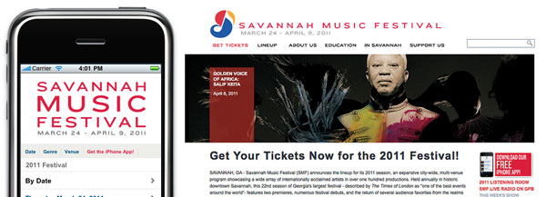
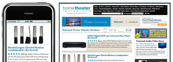
Mobile Templates
Flow: With mobile templates, a visitor enters your website URL or follows a link to a page on your website. Then the website detects if the user is on a specified mobile device. Instead of serving a mobile stylesheet, it redirects the URL to a mobile-optimized version. This mobile-optimized version has a unique URL, separate from the "default" desktop browser URL. It has its own unique HTML base and associated javascript and CSS.
Benefits: With unique Mobile Templates, you have complete control of your layout and site behavior in mobile devices and are not limited by your original website's HTML code. You can make the website look and behave like a native iPhone or Android app for example. You can also take advantage of code optimized for touch input and compressed for optimal mobile speed.
Drawbacks: When using Mobile Templates, you need to maintain an additional set of HTML files for your mobile site. In many ways, you are running two completely separate websites. Content Management Systems like Movable Type and Wordpress make that chore much easier. But, for future maintenance and code changes, you are doubling the amount of work that may be involved.
Which is right for you?
Ultimately, you need to weigh the benefits of each option carefully. For many websites, their budget and time constraints may lean toward the simplicity of Mobile CSS. If you expect to rely heavily on your mobile presence to process e-commerce transactions or provide pertinent on-the-go information, you may need the ultimate flexibility of a Mobile Template. If you'd like to discuss your options with Heideldesign, Let's Talk.